Saturday, December 3, 2016

Photojournalist Profile


Disclaimer: This is a first person fictional blog to honor and give light to one of the greatest photojournalists in recent times, Tim Hetherington.
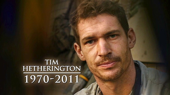
Photo by: Unknown
Image Source: http://abcnews.go.com/International/restrepo-director-tim-hetherington-chris-hondros-killed-libya/story?id=13418813

Welcome to my blog. My name is Tim Hetherington and I am a British born photojournalist. Here you will be able to see some of my work and I will include a brief background of my work and experiences.

Career Path


     A bit into my background; I studied Literature at Oxford University and worked in book publishing until 1996. I spent about two years in India, and when I returned, everyone asked how it went, but I couldn’t fully express how amazing my experiences were. Then, a friend of mine took me to see a French film called Sans Soleil, and it expressed on screen everything that I felt inside that I couldn’t express in words. From there, I decided to change my profession to photography and found my passion in photographing real issues going on in our world. I started working as a staff photographer for “The Big Issue” magazine. This magazine was sold by the homeless and long term unemployed. I liked photographing serious topics, and despised getting celebrity assignments. So, while still working at the UK, I heard of a football team of ex-combatants coming for three weeks on tour. I found out that a non-governmental organization was organizing this event, and they told me that they were looking for someone to go to Liberia to photograph the guys playing. I jumped at the opportunity and was blown away by it. One of the pictures I took there won second prize at the World Press Photo. This catapulted my career and led to me working in nearly thirty countries across Africa. I consider myself a war or conflict freelance photographer and filmmaker. I lived about eight years in West Africa, trying to document the effects of civil war in civilians daily lives. Back in 2007, I began a yearlong assignment with a fellow Vanity Fair contributor and friend, Sebastian Junger. We followed a battalion of American troops in Afghanistan and this became the basis of our documentary called “Restrepo”. It was nominated for an Oscar in 2010 and I invite everyone to watch it.

Image Source: https://lindapittwood.org/2013/12/23/you-never-see-them-like-this-tim-hetherington/
In the principles, I chose the following ones, what feelings does the image create? After doing my research, I found this picture from when Tim was working in Afghanistan. The film Restrepo, was not just documenting the soldiers at war, but their downtime, the moments of boredom and silliness, and this image made me feel like they are just like any 20 something year old man, that when bored, they play video games. It was a relaxing moment for them while surrounded by all the chaos. The second principle I used was Quality of Light. The quality of light is very poor. You can barely see the other guy sitting next to him. It makes the environment look dark, depressing, and unsanitary. The third principle I used was does the image remind you of any work of art or photograph you have seen?  The image does not remind me of other work I have seen. This image look kind of amateur although I know it is not. It just looks very natural like Tim put no effort into the image, yet was able to still make it mean something. 

Era

I have been a photojournalist for over ten years, starting off in the late 1990’s until 2011. I worked in a time where there was much conflict, post 9/11. As my dear friend, Sebastian Junger explained, “the role of the war photographer might seem obsolete, but no. Today’s conflicts demand experienced chroniclers to record a nuanced truth- and to counter the rampant distortion and propaganda of the Digital Age”.

Motivation

     I like to call myself a documentary image maker, still and moving, because the real world on the agenda is really important at a time when we’re increasingly disconnected from parts of the world on whom we depend. Many people fail to realize that documenting war and conflicts in war torn countries, is very dangerous and you can’t just land in the middle of a battle, unprepared for the realities of war. I saw an unbelievable number of young kids running around Libya with cameras unprepared for the realities of war.


Image source: http://www.foto8.com/issue05/liberiasoc01.html
In the principles, I used Is the image Black & White or in color? The image is in black and white by choice. It made the image have a deeper meaning instead of just kids playing in the street. It gives it a somber feeling. The second principle used is the use of lines. The lines helps the main focus to be centered in the middle box. The third principle used is the use of shadows. The shadows of the lines or the rods shows the image of destruction yet happiness as the children play.

Technology

     When I began covering war, I photographed in medium format in 2002. This made the photos look more natural and made it so I also had the ability to enlarge the pictures on gallery walls if needed. Black and white seemed to me a very clichéd view of Africa, so I began using color. The camera I used for stills was the 5D. I usually shot with a 28-70, sometimes a 135 prime. I shoot manual sometimes; sometimes I shoot Program and under-rate it, depending on the light. I just do whatever works. I used medium format cameras loaded with color negative film, making my images thoughtful rather than exploitive. Here is the thing, documentary photography is depleted in its traditional form. The production and distribution of images is rapidly shifting and it’s not enough for a photographer to just make pictures, you have to consider who has access and how the images are experienced.

Ethics

     Every filmmaker or photographer asks themselves how they want to portray the subjects of their film, what to shoot or not to shoot, how to edit so that the film stays true to its topic and subjects, but still compels the audience. While filming Restrepo, we put ourselves in the same risk as the soldiers we were documenting. Junger and I followed these soldiers into battle and recorded the terrible fear and tension, we both were injured at times. Yet the fact that we kept coming back, gave us a ton of credibility with the soldiers. We tried not to record injured American soldiers, to ask their permission if they were used. Besides, we did not want a graphic representation of violence that would distract the message we were trying to show.

Image Source: http://wearetheperiscope.com/detail.php?id=29
In the principles, I used exposure time, because this group of what I am assuming is rebels, are in motion kind of in a march. Since they are moving it is hard to capture them and not have the image come out as clear as it did, so a fast shutter speed must have been used. The second principle used is in or out of focus, because they are in focus but the background is out of focus. This help the focus stay on them and not distract the viewer with them background. The third principle was background compliments or detract from composition. I chose this principle for the same reason as the previous principle. If the background was in focus, it would have competed for attention. since it is out of focus it compliments the picture.  

Bias

     Through my work, I tried my hardest to remain impartial and unbiased. I also tried to cover conflicts that would not otherwise be fully covered via mainstream media outlets. My goal is to give view into conflicts that others would not necessarily know about. My view is that we’re journalists, so our default position is we’re not writing an editorial. We are trying to bring information to our readers, viewers, so that they can make their own conclusions. In some of my work, there may be some sense of political or social bias, but that judgment would be left for the viewer of my images.

Impact

     As I am no longer here anymore, I often wonder what my impact was. My life was tragically cut short on 2011, by a mortar round while I was unassigned. I was covering armed conflict in Libya. I look down to see how my dear friends and colleagues describe how much of an impact I had not just on them, but with the world. According to Kenneth Roth, the executive director of Human Rights Watch says, “he had an extraordinary talent for documenting, in compassionate and beautiful imagery, the human stories behind the headlines”, and the organization further claims to say that “in every assignment, he demonstrated a remarkable sensitivity to his subjects, a tender insight into their human ordeals, and a keen sense of how visual imagery could be used to effect positive social change”. I hope that during my short time in the photojournalism world, I was able to do that.
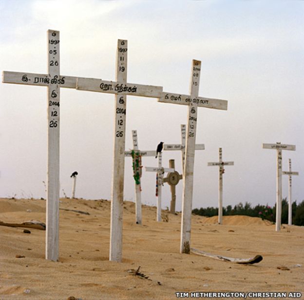

Image Source: http://www.bbc.com/news/magazine-30376169
The principle I used was Keep it simple. Not much is needed to get the point across that a tragedy occurred there. This was taken after the 2004 tsunami, when Tim traveled there to capture images and talk to the communities affected by it. Those in that village made a grave for their lost love ones on top of a hill. The second principle is contrast appropriate. There really isn't a difference between the light and dark areas, hence the contrast is low.  It helps make the image feel calm or relaxed, like it is a somber place to visit. The last principle used obvious main subject, about 1/4 to 2/3 of image area. The image's main subject is about 2/3 of the whole image. There are other crosses in the background but the main ones are the three in the front. It does not crowd the edges and the impact of the image would be lost if the images were not there. 
Viewpoints

     I am described as insightful, committed to the people I told the stories of, and empathetic. James Brabazon says, “I learned from Tim that without curiosity there can be no message, no image, no truth. That beauty is not inferior to truth; and that truth is not tempered by beauty”. Art Blundell says “he looked for the special thing about you, and that inspired you to look at the people around you with new eyes. Yet with every image he took, it is the photographer whose soul is tortured”.

Your Major at AIC

     I am a senior Nursing Student at AIC. Photojournalism and Nursing seems like polar opposite careers. But, if you really think about Tim’s ideology and goals, he wanted to create social change by creating stories through images. He showed the humanity behind the conflict and treated his subject’s with dignity and respect. How is that any different than the core values instilled in every nurse’s education.

Photo By: Odd Anderson
Image Source: http://www.npr.org/sections/pictureshow/2011/05/09/136053477/the-perilous-job-of-conflict-photography

Saturday, November 19, 2016

Chapter 9


Image by: Unknown


     Tim Hetherington was a British photographer, human rights advocate, journalist, filmmaker, and communicator, until April 20th 2011, when he was killed in Libya. The country was in the middle of a civil war and he was there covering it, when a mortar hit his group, and the shrapnel caused Tim to bleed out and lose his life. Covering war led him coin term “the feedback loop”, which describes how the media informs the men and women at war about what is going on at home, and in turn they inform the media of what is going on with them. When trying to describe why he risks his life photographing in very dangerous situations and in war torn countries, he best explained it as “I want to connect with real people, to document them in real circumstances, where there aren’t any neat solutions”. Tim was like many other photojournalists, where they see suffering, and ask themselves, how well can they tell the story of these folks who are really working hard to get out of poverty, or situation.


Photo By: Tim Hetherington


Photo By: Todd Stoddart
   
     Don McCullin is another British photojournalist and has been risking his life covering wars, for over 50 years now. He still continues to be a devoted photographer, even in his 80’s, stating “I know I haven’t got that many years left, and I need to devote them to photography”. He claims that his early motivators wasn’t to change people’s perceptions, it was to take good pictures and flaunt them to other photographers. His epiphany came in 1969 where he “should have been making people think the images I was making were of things that should be unacceptable in our world”. When he was watching kids dropping dead in front of him, changed his whole attitude on photojournalism. What Don McCullin was referring to is what Ed Kashi refers to as “advocacy journalism, where the goal is tell visual stories that not only inform viewers but also inspire them to find activist solutions to social problems”
Photo By: Don McCullen


.
                                                                    Photo by: Unknown

      Gordon Parks is a photojournalist and humanitarian with a focus on “social justice, race relations, poverty, civil rights, and urban life”, according to the foundations website. He worked for Life magazine for 20 years, capturing subjects that were related to racism and poverty. He documented the Civil Rights Movement and was a tireless advocate as well. According to Gordon Parks, “in the early days of racism, it only made me work all that much more to prove to the world that I could do this. You first have to have desire, then the courage to fulfill that desire”.
Photo By: Gordon Parks


     My personal motivators are not as extravagant as other people but in a nutshell, this is what motivates me. My biggest motivator has and always will be my son. He is what keeps me going when all I want to do is give up sometimes. I keep going because I want to be able to provide him a better life than what I had growing up, and to instill a drive in him to never give up. The photojournalists that I researched all had a motivator to advocate for social issues plaguing our world, and that is very noble of them. My calling is not as big as theirs but a small change in the cycle of poverty and doing the best I can as a mother, plays a small role in breaking the chains that binds many minorities and people of color. Our children are always set up for failure because of our color and background, and helping my son break those chains can help prepare him to be a better man of color when he grows up. Money is always a motivator for most people. No matter how much we don't want to be tied down to it, it is a huge factor in everything we do directly or indirectly. I am sure that the best photojournalists, would not have been able to do what they did if they could not afford all the equipment they own. My boyfriend is the little voice that is constantly saying keep going and rooting for me, every step that I go. I tend to second guess myself a lot and he is always putting all his faith in me, which helps by pushing me to accomplish my goals. Lastly, personal growth is something that I am sure everyone aspires for. For them it was photojournalism, for me it is education, Nursing in particular. As I get older, I don't want to be stuck doing the same thing I was doing 10 years ago and so on. For all of us it is finding our own purpose in life, and what we contribute to our society. This gives us an opportunity to self-actualize ourselves and be the best people we can be.  

Sunday, November 13, 2016

Chapter 8

                                                                   Going Home
                                                              Photo By: Ed Clark
                                   Image Source: http://www.thegreatleapsideways.com/?p=209


        This image is of a Navy shipman following the funeral procession of FDR. Clearly he is deeply affected by his death and everyone behind him is also sad by his departure. FDR did so many good things for this country and not just for the white and privileged, but for everyone. He created economic growth for the country, created the FDIC, and Social Security Administration. My point is, he was one of Americas greatest presidents and when he died, everyone mourned his loss. Right now, with everything going on with our disgrace of a new president, I feel like this man feels right now, because after January, everything our forefathers and greatest leaders since the birth of our nation accomplished, will be thrown our the window and society will step back into the early 20th century. I am sure those people in the image are scared of what's to come after their greatest leader died, as I and I am and I'm sure many others, are scared to see what is to come in the next 4 years. According to  a German newspaper, "American society hardly has a chance of survival other than becoming a modernized, diverse economic construct. That's the opposite of what Trump envisions. Racism and hatred will have to serve as a substitute for keeping promises". Although Obama hasn't left the office yet, or hasn't died, I feel like our nation has died and most of us are mourning it. This image shows the raw emotion of losing a great leader, and can be comparable to when America lost JFK back in 1963 and now as Obama leaves. With the four ways of knowing, I would have to use emotion/intuition because this image provoked a big surge of emotions.

Subjects Expression: This was a candid picture. The man was not relaxed because he was really emotional when the picture was taken. He represented what many Americans during that time were feeling.

In or out of focus: The image if focused on the Navy shipman, and he is in clear focus down to seeing the tears coming down his face. Everyone else in the background is out of focus but you can clearly see their emotion on their faces. It helped the image by allowing the viewer to just focus on the main subject, and allowed the people in the background to support the subject's feelings.

Is the image black & white or color?: The image is in black & white not by choice. It was taken during a time when color imaging was possible. It had more of an impact than if it was taken in color.

Photo by: Unknown
Photo year:2016
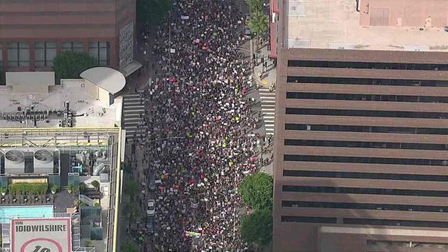
Image source: http://abc7.com/news/over-10k-march-in-largest-anti-trump-protest-in-dtla/1603923/


        This image represents our truth right now. Ever since this past Wednesday, many cities have been protesting and it hasn't lost any momentum since. This image was taken November 12th at a protest in LA and they estimated about 8,000 protesters. This image shows how large the crowd is versus a photo taken from the ground. All of the images seen from all the protests going on, gives me pride to see our people coming together to try to stop a man that represents everything that our country has fought hard to overcome, and has made it okay for his followers to voice their hatred towards those that are not like them. I feel like this image represents the magnitude of people that are scared to death of the future of this country and the future for our children, and are not willing to go down without a fight. Like the EuroMaidan protestors, Americans have "been consumed by TV, by news images repurposed for a new battle, but were now referencing their own protest history. They promised to put on a show, and the media came to participate".On the flip side, as Professor Nordell stated, "in our image saturated time, it's of vital importance to look at the biases of the publications that present imaging. It's of vital importance to look at the possible biases of the photojournalists creating the images, as well as taking a look at our own biases". On the four ways of knowing article, I would have to use sense perception because as you look at the picture you can easily perceive it as a gathering of people for higher cause.

Texture: I view this image as rough. The buildings surrounding the crowd, make the image look hard and rough. It helps create a feeling of unity, of not going down without a fight. It makes the image look powerful because it sends the message of power in numbers.

Background compliments or detracts from composition: I feel like the buildings compete for the attention of the main focus. The background is not out of focus and if it was, it may have helped a little. More of a focus should have been given to the crowd, although from the looks of it, it seems like if it was taken by a camera that is not used for photojournalism.

Use of lines: Looking at the image, I see vertical perpendicular lines in the images. One line to divide the left side of the buildings with the crowd, and the other line to separate the crowd with the building on the right side. The lines help keep the attention inside the two lines.

                                                       Photo by: Alex Garcia
                                                       Photo year: 2012
                              Image source: http://newsblogs.chicagotribune.com/assignment-chicago/2012/02/

        This image was clearly staged and represents not a truthful image. It wasn't like this couple got married right smack in the middle of a protest and the photographer snapped the picture, they actually showed up to the protest and staged the picture. Why? I have no idea, except that whatever the protest was about, maybe the couple felt strongly about it and wanted to incorporate it in their wedding photography. I found the image odd because you have a line of riot police standing on guard, during a tense moment, and off to the right you see a happy couple kissing. It's like a confusing wedding picture mixed with photojournalism and frankly I don't get it. It is like telling the news while covering a wedding. According to the good news network, "if news is not really news unless it is bad news, it may be difficult to claim we are an informed nation. The job of photojournalists was to portay accurately what was happening in society", whether it is good news or bad news. And, in this case, it is a combination of both. It is hard to determine what is the real truth in an image, and as a photojournalist, it is hard to decide which picture represents the unbiased truth. As Professor Nordell said about the picture he took of the Governor with the small child, "perhaps this was my favorite picture because as a freelancer, I thought that this image had the highest likelihood of selling", and this may be the force behind other freelancers when choosing their images as their truth. For the four way of knowing article, I would have to say logics/reason because I am still trying to rationalize this image. I have come to the conclusion that this image is not meant to be rationalized and to just take it as is.

Rule of thirds: The main subject is on the outer third on the right side. This allows the background to show the line of police guarding the area.

Obvious main subject, about 1/4 to 2/3 of image area: The main subject is taking up a little over 1/4 of the image. I'd say more like 1/3. It does not crowd the edges. If certain objects would have been left out, it would have just looked like a regular run of the mill wedding picture.

What feelings does the image create?: The picture creates a sense of confusion to me. The analytical side of me wants to know why would anyone want to take their pictures of their wedding, in the middle of a protest. It is such a happy moment, clouded by a uneasy moment. It definitely captured my attention because if you photoshop the couple out, it becomes a photojournalistic image, and if you photoshop the police out, it becomes a regular wedding picture. The two just don't together in my opinion.

Sunday, November 6, 2016

Chapter Seven


     The National Press Photographers Association (NPPA) is a “society that promotes the highest standards in visual journalism”. They set the code of ethics for photojournalists and is considered like their ten commandments that they must follow. They are easy to interpret and are direct. The following three out of the 9 codes are talking about not manipulating any images, whether by staging, altering the image, or altering the image to mislead viewers. It is pretty straight forward and any respected professional photojournalist should have no problem abiding with these “rules”.

     
Photo by: Unknown


     Yet despite how clear the rules are, so many have fallen from grace. One example of a respected photojournalist, is the case of Pulitzer prize-winning freelance photographer Narciso Contreras, which a single image, ruined his respected career. His crime? Violating the ethical standards by altering a photo he took while covering the war in Syria in 2013. What he did wasn’t major, he didn’t change the image to mislead or misrepresent his viewers. He manipulated the image to remove his colleagues camera out from the lower left hand corner of the picture. Here is the thing, Narciso actually turned himself in to the Associated Press and the AP, and according to the New York Time, "decided to review nearly 500 images that had been filed since he began working for them, but they found no other alterations to his images". The AP fired him, because according to the AP, they didn’t want to tarnish the AP’s reputation by allowing photojournalists that do not uphold the code of ethics. 

Photo by: Narciso Contreras


     Contreras admits to feeling ashamed and regrets his decision of removing the camera out of the frame, he told the AP. He knew the camera was in the frame when he took the picture, but he thought it might detract the viewers from the war tension of the image. He was torn on what to do and chose the wrong decision which he has to live with now. If he would have stayed quiet, he would have put in doubt his credibility and the AP for distributing it, so he does not regret his decision of speaking up. 


Photo by: Judith Soto


     My personal view on this issue is they should have given him another chance. He admitted before getting caught of what he did and what he did alter was minute in comparison. The way I would interpret his decision to speak up by using my personal ethics map, is by establishing his core foundations. He has the morals and values, the wisdom to know what he should do after that lapse in judgement, respect and loyalty to his craft, strength to speak up and say something, and integrity to do what is right. Which in this case, was admitting he made a mistake. His career ended with the AP, but he still managed to walk away with his head held high for owning his mistake. If I was him, I would have done exactly what he did and in many different occasions, have owned up to my mistakes and accepted whatever consequence. Nobody is perfect and everyone makes mistakes, and by having integrity, your reputation would not be affected as much.

Sunday, October 30, 2016

women photojournalists

          According to the award winning photojournalist, Lynsey Addario, “most of the work in photojournalism is establishing relationships”. Who better to understand women’s issues than an actual woman? Stephanie Sinclair is an American photojournalist based in Brooklyn NY. She is able to get access to some of the most sensitive gender issues and human rights issues around the world. According to National Geographi, she graduated with her B.S. in journalism and started working in the Chicago Tribune, which sent her to cover the war in Iraq. She now contributes her freelance photography to National Geographic, the New York Times Magazine, Newsweek, Stern, GEO, and Marie Claire, among others. She was awarded the UNICEF’s photo of the year and the Lumix festival for Young Photojournalism Freelens Award for her thorough work on the issue of child marriage.

 Photo By: Stephanie Sinclair
Year Created: 2015
Principle #1: In or out of focus
The image is pretty sharp but the background is slightly out of focus. The mountains in the background help the image to create the overall mood and environment of the image.
Principle #2: Texture
the texture of the background seems very dry and arid. It makes me think of a harsh life and drastic measure needed to be made in order to survive. 
Principle #3: Obvious main subject, about 1/4 to 2/3 of image area
The main subject is in the far right corner of the image, and it does not crowd the edges. If the other couple was not in the picture, I believe the picture would have been more impacting. 
Why did I choose this image?
I chose this image because it represents the sad reality of child marriage. No one seems happy in this picture and is indicative of the life these little girls have to endure. 

          Stephanie Sinclair has won countless awards for her work in female circumcision, women’s issues in Afghanistan, failure of the death penalty in Illinois, she was one of the people that won the Pulitzer prize for documenting the problems within the airline industry in 2000. She has done exhibitions on the consequences of early marriage worldwide, Indonesian female circumcision, images of war, and Breaking the Frame, Pioneering Women Photojournalists. As the photojournalist, Sophia Nahli Allison stated, “I believe visual storytelling is a creative tool for social change”. This quote, I believe is the core of every photojournalist’s belief, and why they do what they do.

Photo by: Unknown
Year created: 2013
Principle #1: Rule of Thirds
Stephanie Sinclair is photographed on the outer third of the frame. 
Principle #2: Is the image in Black & White or Color?
The image is in black and white by choice. It gives the her more credibility, and makes her look more professional. 
Principle #3: Keep it simple
The image is very simple and straight to the point. The white background contrasted with her black clothing makes her pop. 
Why did I choose this image?
I chose the picture of Stephanie Sinclair because it showed how much of a respected photojournalist she is as she is featured on National Geographic. 


          Women scientists often face gender bias and wage discrimination, even though we are in the 21st century. According to AAUW, "Many women scientists and engineers leave their careers because they feel uncomfortable with their male counterparts and their working environments". Many women interviewed have said they have heard their male counterparts say they have gotten their job due to affirmative action. Many men base the validity of a woman’s career on their looks. Last year a Nobel Prize winning biochemist, Tim Hunt, made headline when he said that “the trouble with girls was that three things happen when they are let in the lab, you fall in love with them, they fall in love with you, and when you criticize them, they cry”. 
Photo By: Viktor Koen
Year Created: 2013
Principle #1: Subject's Expression
The female scientist is posing in a very authoritative way. Her facial expression matches her body language. 
Principle #2: Quality of Light
The light behind the subject is bold and centered directly behind her drawing your attention to her. 
Principle #3 What feelings does the image create?
The image created a feeling of power. She is someone to be respected. The explosion in the background makes her seem like a powerful woman.
Why did I choose this image?
I chose this image because she is a scientist and she is highly respected and commands that respect in the image. It represents that she can be a woman and look pretty, yet be smart and highly educated.  

          Studies show that research universities rate applicants with male names are more competent, more hireable, and more deserving of higher pay even though their female counterparts resumes are identical. Men dominate the STEM field jobs and that needs to change. Men need to admit that this is a reality and find the reasons behind the gender bias issues in the scientific world. Women need to always prove themselves to their male counterparts. Like Frances Benjamin Johnston stood for in the early 20th century, women have the right to control their economic, social, and personal lives. In this case, if they wanted to go into a male dominated field, they have every right to do so and be treated and an equal. 

          Personally, I have never been discriminated by my gender due to the fact I have worked in healthcare for the past 15 years. Healthcare is a predominantly female dominated so I have never had an issue with that. On the academic side, I have always been surprisingly good at Mathematics, and when people see that, they always say “wow, you are pretty good at this for a girl”. I understand why they are surprised, but I always feel like saying, so what if I’m a girl? All in all we need more women scientists and to teach men and our future generations about gender equality.

Saturday, October 22, 2016

Technology Timeline

My PowerPoint on some of the photographic technology advances that changed photojournalism throughout history.

Saturday, October 8, 2016

Chapter four

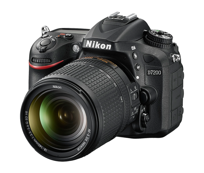
          A DSLR camera is a digital single-lens reflex camera. It works similarly as the technology before, except the quality and response is better. DSLR’s have built in mirrors and the photographer has the ability to change lenses. DSLR cameras have large imaging sensors so, the larger the sensor, the better the picture. Dealing with low lighting, DSLR cameras not only works better because of the larger sensor, but in this case, you can expose the image sensor for as long as you want in most cases. With a DSLR camera you can attach external flashes, fit filters on the end of the lens to change the colors and contrast. The possibilities are endless with this type of camera. 
Photo by: Nikon


          For photojournalists, their job is to “record the human condition as openly and honestly as you can”. Before DSLR’s became a thing, photojournalists would take their pictures, send it to the associated press, and the editors would view the picture, manipulate it and publish them. Meaning, the job of a photojournalist ended after the picture was taken. Now with digital photography, photojournalism which was then considered a "low tech job, has become one of the most technically demanding positions at any media outlet”. They must be an IT manager, write, videographer, video and photo editor, webmaster, and computer repair technician, besides being an accomplished photojournalist. This is due to the fact that most photographer work alone and away from their offices, they need to have all these abilities due to issues that can come about when you least expect it". This type of technology also helped photojournalists by freeing them from the dark room processing and allowed the photos to reach the newsroom in a matter of minutes rather than hours. Also, you can take as many pictures as you want until you get the right one due to the DSLR’s memory capabilities.

          Photojournalism was transformed after digital photography evolved because of how fast the images get out to the public, in comparison to pre-digital photography. In the early 1990’s, photos were sent out via wire services to newspaper companies around the world, and this process took forty minutes per picture to transmit. It was poor quality, unreliable connections. The time it took to physically produce the picture, and send it through the telephone line took about three hours and forty minutes, assuming everything went perfectly. Not just that, but photojournalists had to lug "travel kits that consisted of five large plastic cases containing a darkroom and transmitting equipment", among all of their camera equipment. According to Professor Nordell, "technology from the 1990's to the present, the amount of change in that period, is just astronomical. It almost dwarfs the amount of change from 1840 to 1990". 

          The DSLR camera will have two viewfinders, the digital display and the eyepiece. The eyepiece is the most accurate way to view the picture before taking it. Its light is reflected twice, first through a mirror, then through a pentaprism or pentamirror. This prevents the picture to be unreversed. When you take the picture, the mirror moves, which causes the viewfinder to go black for a moment, so the light can shine right into the sensor. In wet plate collodion process, in order to develop a picture, you have to coat it with chemicals, sensitize it, and expose it, all within a fifteen minute window using a darkroom. "Collodion photography is difficult and somewhat dangerous to do". This process during the Civil War was especially challenging, because they had to travel with their wagons full of chemicals. "Each time they moved, they had to secure the chemicals and plates. Each time they stopped, they had to be level". Both processes are very different and the only similarity found, is that they both have the ability to create a picture with fine detail. 
Photo By: Luo Dan